Case Study 1
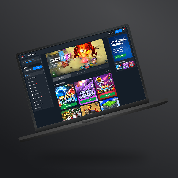
MaxDuel
A high-traffic iGaming platform focused on player retention and engagement.
Challenge:
Low player retention due to low visibility and poor prioritization of platform notifications.
Assumption:
Improving the notification centre structure, visibility and usability would lead to increased player engagement and encourage users to return to the platform more frequently.
Scope of Work:
UX analysis and redesign of the notification centre, including information architecture improvements, interaction design, and notification prioritization.
Goal:
Increase player engagement and improve player retention rate through better notification visibility and interaction.
Key Responsibilities:
UX Research
Information Architecture
Ideation
Wireframing
Prototyping
Iterating
High-Fidelity Mockup
Microinteractions
Developer Handoff
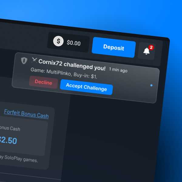
Key issues with existing solution:
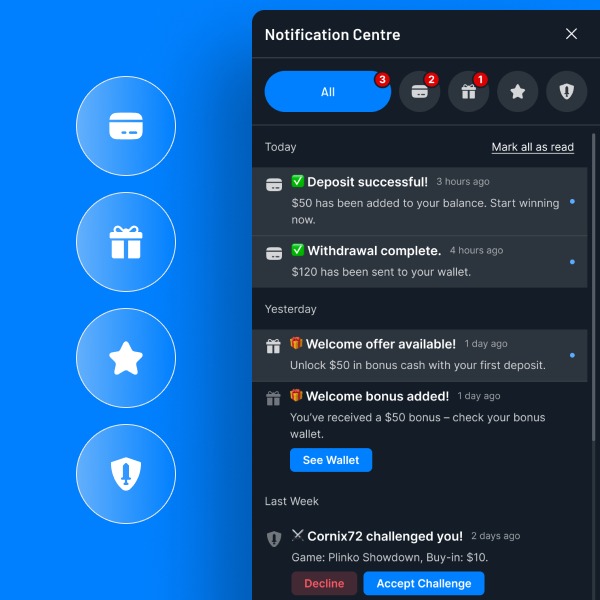
Notification centre with no clear grouping structure. Various notification types are collected within the same group. Lack of CTA within a notification.
Result: User confusion and frustration, no clear action and abandonment.
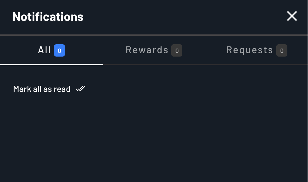
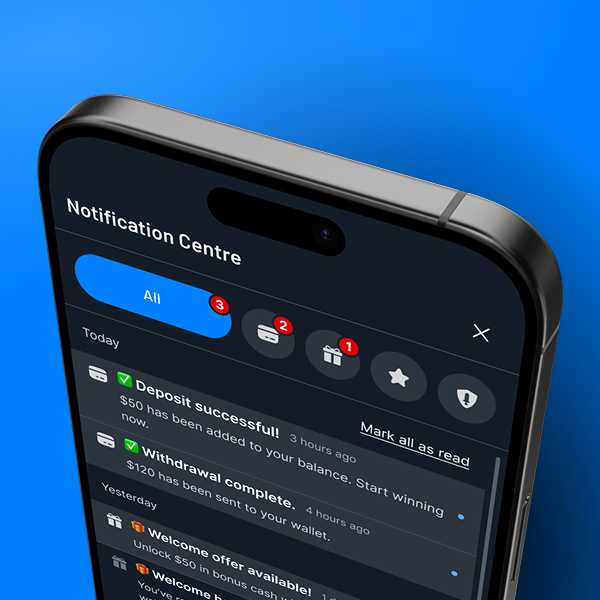
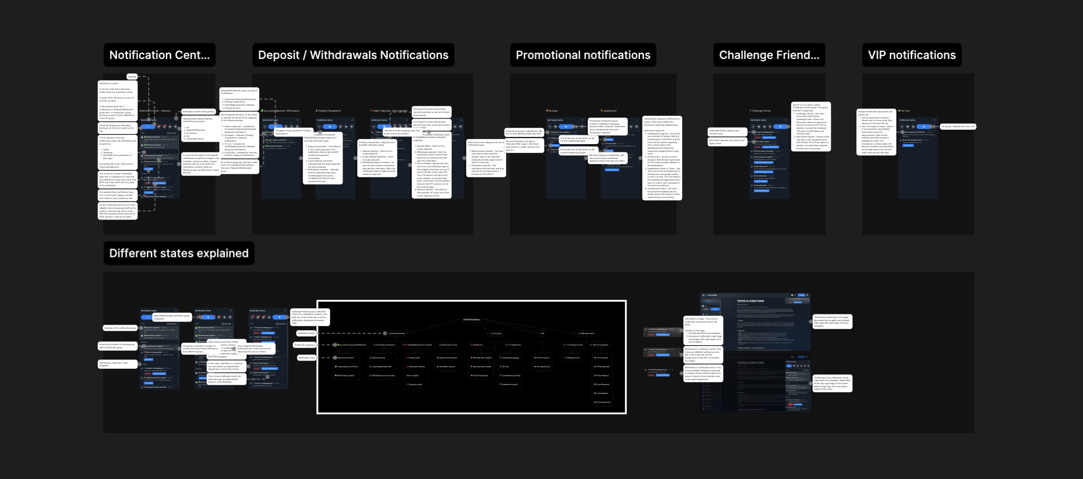
Defining Notifications
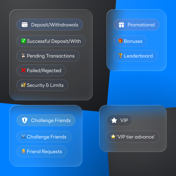
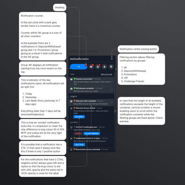
Defining main notification groups:
All Notifications
- Deposit / Withdrawals
- Promotional
- VIP
- Challenge Friends
Defining notification subgroups:
- Deposit / Withdrawals
1.1. Successful Deposits/Withs
1.2. Pending Transactions
1.3. Failed Transactions
1.4. Security & Limits
Defining possible notification instances:
1.1. Successful Deposits/Withs
"Deposit Successfully"
"Crypto Deposit Confirmed"
"Withdrawal Completed"
"..."
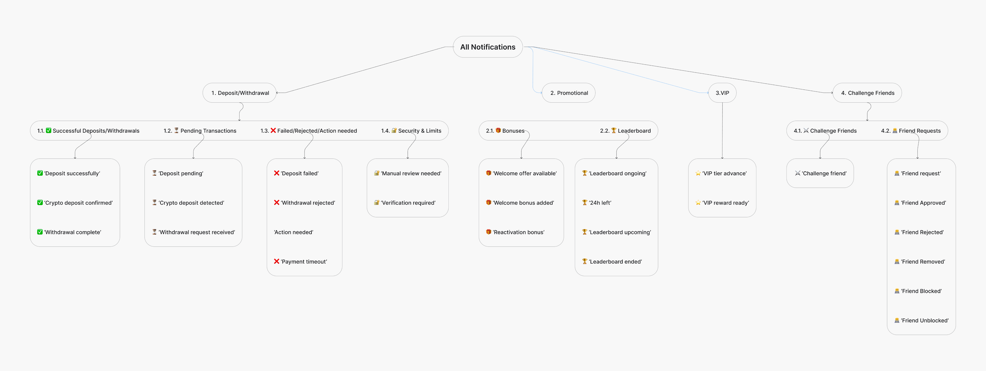
Visual Labelling

Deposit/Withdrawals
✅ Successful Deposit/With
⏳ Pending Transactions
❌ Failed/Rejected
🔐 Security & Limits

Promotional
🎁 Bonuses
🏆 Leaderboard

VIP
⭐️ ‘VIP tier advance’

Challenge Friends
⚔️ Challenge Friends
👨💻 Friend Requests
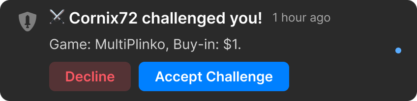
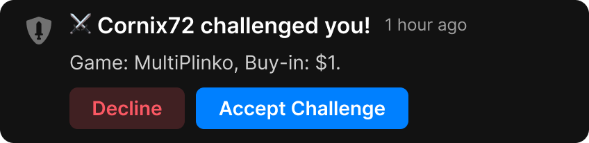
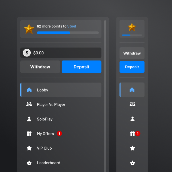
Notification Anatomy
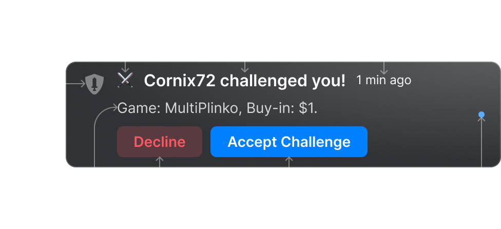
1
Group Indicator - visually distinguished using icon
2
Subgroup Indicator - visually distinguished using emoji
3
Notification Title - concise summary of the notification
4
Time Stamp - provides exact time event occurred
5
Notification Message - provides additional information
6
CTA(s) - optional, where action is needed
7
Notification Status - read or unread
Notification States
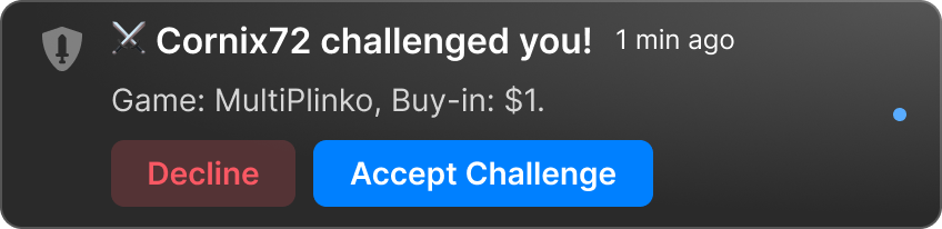
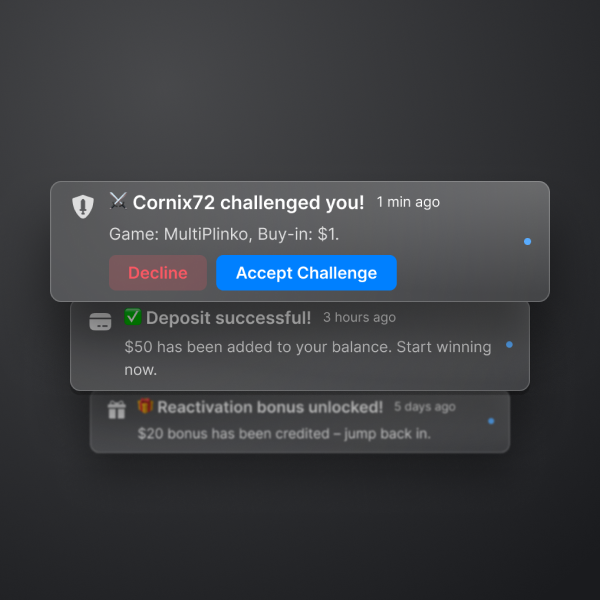
Outside notification centre
Positioned at the top right of the screen
In the notification centre
Status: UNREAD
In the notification centre
Status: READ
Developer Handoff
Project Summary
Challenge:
Low player retention due to low visibility and poor prioritization of platform notifications.
Assumption:
Improving the notification centre structure, visibility and usability would lead to increased player engagement and encourage users to return to the platform more frequently.
Scope of Work:
UX analysis and redesign of the notification centre, including information architecture improvements, interaction design, and notification prioritization.
Goal:
Increase player engagement and improve player retention rate through better notification visibility and interaction.
Result:
Player retention rate increased by approx. 15% within 8 weeks after implementation.
Conclusion:
Notifications were reorganized and prioritized to highlight time-sensitive promotions and important system updates. New interaction patterns made it easier for players to view, dismiss, and act on notifications. Important notifications became more discoverable, increasing engagement with promotional events and platform updates.
Interested in seeing more?
Case Study: OptyFlow

Favourite Books:


Favourite Songs:


All rights reserved.
Case Study 1
MaxDuel
A high-traffic iGaming platform focused on player retention and engagement.
Challenge:
Low player retention due to low visibility and poor prioritization of platform notifications.
Assumption:
Improving the notification centre structure, visibility and usability would lead to increased player engagement and encourage users to return to the platform more frequently.
Scope of Work:
UX analysis and redesign of the notification centre, including information architecture improvements, interaction design, and notification prioritization.
Goal:
Increase player engagement and improve player retention rate through better notification visibility and interaction.
Key Responsibilities:
UX Research
Information Architecture
Ideation
Wireframing
Prototyping
Iterating
High-Fidelity Mockup
Microinteractions
Developer Handoff
Key issues with existing solution:
Notification centre with no clear grouping structure. Various notification types are collected within the same group. Lack of CTA within a notification.
Result: User confusion and frustration, no clear action and abandonment.
Defining Notifications
Defining main notification groups:
All Notifications
- Deposit / Withdrawals
- Promotional
- VIP
- Challenge Friends
Defining notification subgroups:
- Deposit / Withdrawals
1.1. Successful Deposits/Withs
1.2. Pending Transactions
1.3. Failed Transactions
1.4. Security & Limits
Defining possible notification instances:
1.1. Successful Deposits/Withs
"Deposit Successfully"
"Crypto Deposit Confirmed"
"Withdrawal Completed"
"..."
Visual Labelling
Deposit/Withdrawals
✅ Successful Deposit/With
⏳ Pending Transactions
❌ Failed/Rejected
🔐 Security & Limits
Promotional
🎁 Bonuses
🏆 Leaderboard
VIP
⭐️ ‘VIP tier advance’
Challenge Friends
⚔️ Challenge Friends
👨💻 Friend Requests
Notification Anatomy
1
Group Indicator - visually distinguished using icon
2
Subgroup Indicator - visually distinguished using emoji
3
Notification Title - concise summary of the notification
4
Time Stamp - provides exact time event occurred
5
Notification Message - provides additional information
6
CTA(s) - optional, where action is needed
7
Notification Status - read or unread
Notification States
Outside notification centre
Positioned at the top right of the screen
In the notification centre
Status: UNREAD
In the notification centre
Status: READ
Developer Handoff
Project Summary
Challenge:
Low player retention due to low visibility and poor prioritization of platform notifications.
Assumption:
Improving the notification centre structure, visibility and usability would lead to increased player engagement and encourage users to return to the platform more frequently.
Scope of Work:
UX analysis and redesign of the notification centre, including information architecture improvements, interaction design, and notification prioritization.
Goal:
Increase player engagement and improve player retention rate through better notification visibility and interaction.
Result:
Player retention rate increased by approx. 15% within 8 weeks after implementation.
Conclusion:
Notifications were reorganized and prioritized to highlight time-sensitive promotions and important system updates. New interaction patterns made it easier for players to view, dismiss, and act on notifications. Important notifications became more discoverable, increasing engagement with promotional events and platform updates.
Interested in seeing more?
Case Study: OptyFlow
Favourite Books:
Favourite Songs:
All rights reserved.